There are three types of measurement for data analysis:
1. Nominal
We just nominate some thing like:
(Man or Woman, Boy or Girl, Good or Bad etc.)
2. Ordinal:
Values are increases in a particular sequence or order like:
(age, salary etc.)
3. Scale
It represents the values in scale like:
(Strongly Disagree, disagree, Neutral, Agree, Strongly agree etc)
Now enter the data into spss software:


In data analysis there are some test used for data analysis:
Apply: open spss file click on Analyze ---> Descriptive statistics ---> Frequencies ---> Drag the variables into "Variable(s)" box and click ok.

Interpretation:
(Just explain the frequencies and percentages of the the variables in the interpretation of the table.)
The job nature table shows that 97 respondents are doing primary jobs and 52 are doing part time jobs out of 150. As we see the percentage 64.7% respondents who are doing primary jobs and 34.7 are doing part time jobs.
This
table shows frequencies of Gender, Age and Nature of job. The frequency of the
gender column in the frequency table shows that 101 male respondents participate
in the research and 49 female respondents take part in the research with the
overall total of 150. According to percentage column 67.3% are male and 32.7%
are female respondents in the research. This shows that male respondents are
higher than the female respondents.
According
to age table 39 respondents age is less than 25, while 53 respondents age is in
between 25-35 years and 41 respondents are in between 35-45 years and only 17
respondents age are greater than 45. If we look at the percentages highest
percentage of respondents is 35.3% who’s age are 25-35 years. The second
highest percentage of the respondent’s age is in between 35-45 years with the
percentage of 27.3%. 26.0% respondent’s age are less than 25 years and only 11.3%
participant’s age are 45 years plus.
The job nature table shows that 97 respondents are doing primary jobs and 52 are doing part time jobs out of 150. As we see the percentage 64.7% respondents who are doing primary jobs and 34.7 are doing part time jobs.
2) Reliability test (only for questionnaire):
Apply: open spss file click on Analyze ---> scale ---> Reliability analysis ---> Drag the variables into "items" box and click ok.
(Note: Apply the reliability test on all computed variables.)

Interpretation:
Explain the Cronbach’s alpha values of the variables. If the most the values are greater than 0.70 that's mean your Questionnaire is reliable.
Explain the Cronbach’s alpha values of the variables. If the most the values are greater than 0.70 that's mean your Questionnaire is reliable.
3) Histogram:
Apply: open spss file click on Graphs ---> legacy dailogs ---> Interective ---> Histogram ---> Drag the variable into horizontal box and click ok.
Step 1:
Double click on Histogram in output view of SPSS software. click on "Show distribution curve" button in "Chart Editor" window.

Step 2:
After clicking on "Show distribution curve" button. A small window of "Properties" will be appear make sure "Normal" has been marked and click on close button.

Final output view of Histogram:

(Just mention the values in which most of the data relay and also tell that curve in Normal, Negative skewed or Positive skewed. By examining above diagram.)
This fig. is the
graphical representation of data collected during research and showing the
response of respondents about abc.
Most of the respondents were in between 3
to 5. Similarly small numbers of respondents were marked very small options. The
bars in the histogram from a distribution curve that is similar to the normal.
bell shaped curve Thus, frequency distribution of the data approximately normally
distributed.
4) Descriptive statistics:
Apply: open spss file click on Analyze ---> Descriptive statistics ---> Descriptive ---> Drag the variables into "Variable(s)" box and click ok.
Interpretation:
(Just describe the mean, maximum, minimum and Std. deviation values of each variable.)
(Just describe the mean, maximum, minimum and Std. deviation values of each variable.)
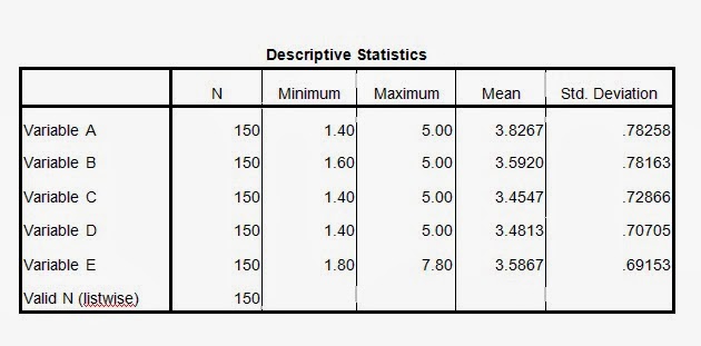
This table presents the descriptive statistics that show the
overall picture of all the five variables. There were scales of 5
responses that lead to the options (strongly disagree, disagree, neutral,
agree, and strongly agree). Number of observations of each variable is 150. In the above table the mean
values and the values of standard
deviation of all the 6 variables have been shown.
Mean value provides the idea about the central tendency of the values of a
variable. Like Variable A (mean: 3.8267),
Variable B (mean: 3.5920), Variable C (mean: 3.4547),
Variable D (mean: 3.4813), and Variable E (mean: 3.5867). The minimum values
vary between 1.40 to 1.80 and maximum values vary between 5.00 to 7.80. Standard
deviation shows the possible variation among the question discussed. Calculation
of the discussed data of all the variables for the standard deviation are, Variable
A (Std. Deviation:
.78258), Variable B (Std. Deviation:
.78163), Variable C
(Std. Deviation: .72866), Variable D (Std.
Deviation: .70705) and Variable
E (Std. Deviation: .69153).
Apply: open spss file click on Graphs ---> legacy dailogs ---> Interective ---> Scatter plot ---> Drag the variable into horizontal and vertical box and click ok.
Step 1:
Double click on Scatter plot in output view of SPSS software. click on "Add Fit Line at Total" button in "Chart Editor" window.

After clicking on "Add Fit Line at Total" button. A small window of "Properties" will be appear make sure "Linear" has been marked and click on close button.

Step 3:
Repeat the step 1 and 2. this time make sure "Quadratic" has been marked in the "Properties" window.

Final output view of Scatter plot:
Interpretation:
(Just tell about the trend of the Linear line and calculate the difference of Quadratic and Linear values. If the difference is less than 0.05 than we apply person correlation. If the value is more than 0.05 than we apply Speraman correlation.)
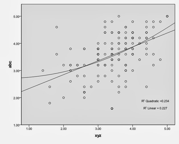
The fig. shows the scatter plot test between Abc and XYZ. In this figure linear regression line move from lower to upward. Which suggest that there is a positive trend between Abc and XYZ. The value of R square quadratic is 0.234 and R square linear is 0.227 (0.234 – 0.227 = 0.007). The difference between two values is less that 0.05 so there is also linear association among Abc and XYZ.
6) Co-relation:
Apply: open spss file click on Analyze ---> correlate ---> Bivariate ---> Drag the variables into "Variables" box and check Person and Spearman click ok.
(Note: if the difference of Quadratic and Liner values is less then 0.05 then check Person. If more than 0.05 then check Spearman)
.bmp)
Interpretation:
(first see the sig.(2 tailed) value if the value is less than 0.05 then their is relationship between two variables. If the value of sig. (2 tailed) is more than 0.05 then there is no relationship. If the relationship exist between two variables by seeing sig (2 tailed) value then we tell about the strength and direction of the variable by seeing person correlation or correlation coefficient value.)
The hypothesis of these variables is:
Ho: There is no association between Variable
A and Variable B.
H1= There is association between Variable
A and Variable B.
In table Variable A has relationship
with Variable B, because the P-Value = .000 which is less than 0.05. So Ho is
rejected and H1 is accepted. The Pearson correlation value of Variable A and Variable
B is .614 which shows the positive and moderate relationship.Strength:
- Less the 0.33 then weak relationship.
- 0.33 to 0.70 then moderate relationship.
- More then 0.70 then strong relationship.
Direction:
- If person correlation or correlation coefficient value has no negative sign (-) its mean it shows positive direction.
- If person correlation or correlation coefficient value has negative sign (-) its mean it shows negative direction.
7) Regression:
Apply: open spss file click on Analyze ---> Regression ---> Linear ---> Drag the Dependant variable into "Dependant:" box and drag the independant variable into "Independant(s):" click ok.

Interpretation:
(sig. value in the coefficients table and ANOVA table tell about the relationship between variables if the sig. value is less than 0.05 then there is relationship. And the Adjusted R2 value in the Model summary table shows the contribution of the independent variable to the dependant variable in percentage.)
Xyz= a + bx1
Xyz = 2.922 +
.260 (Abc)
According to Coefficient
table Abc has relationship with Xyz because the Privation sig-Value of these
variables in Coefficient table is .004 which is less than 0.05 so we conclude
that Abc has significant effect on Xyz. According to ANOVA table p-value is
.004 which is less than 0.05 indicate that model is good fit. In model summary
table adjusted R square value is .049 which shows that positive contribution of
independent variables on dependent variable. Abc 4.9 % contribute to Xyz of 95.1 % is
contributed.
No comments:
Post a Comment